
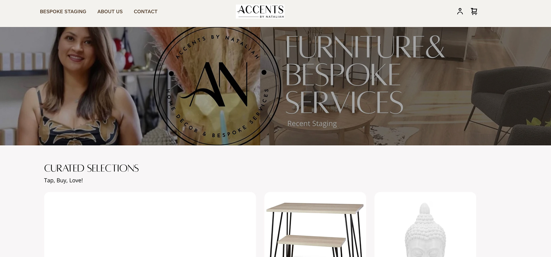
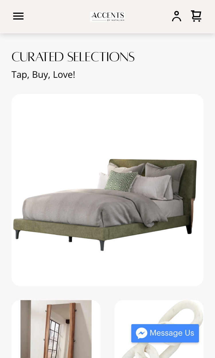
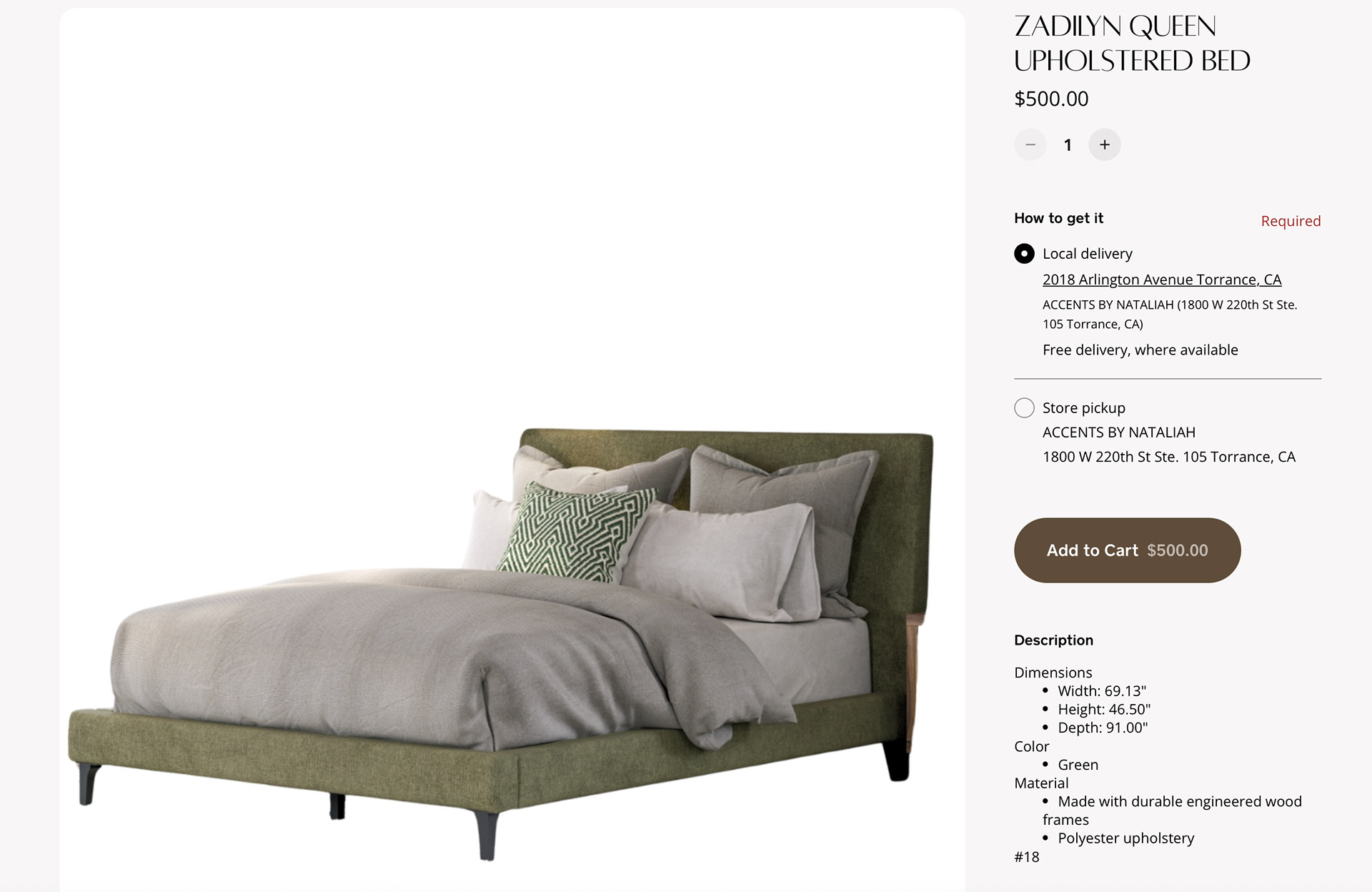
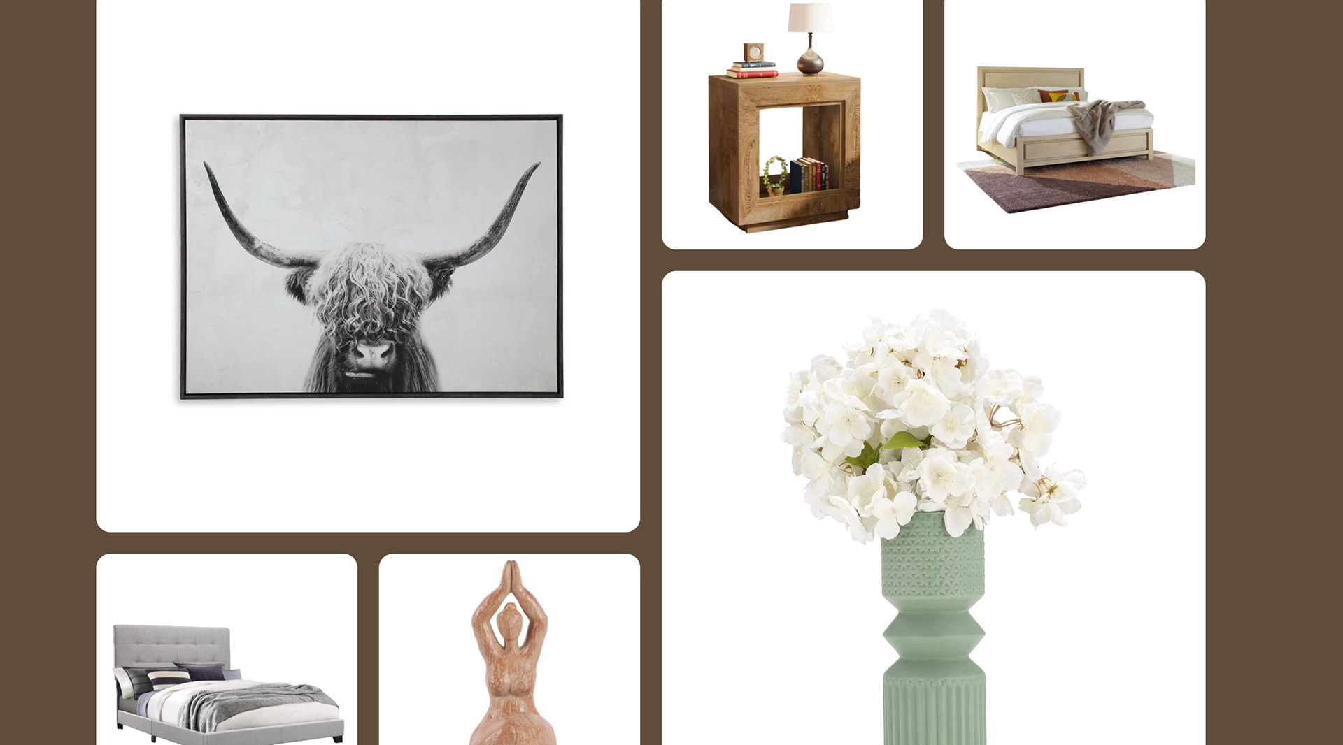
"The Client requested creating a middle ground for her furniture and staging Square website; something appealing to younger generations while simultaneously using the sleek and minimalistic business design she already had. Ultimately, the solution was to make the website simpler than it had already been, focusing more on grabbing and keeping attention. All products were moved to the front page, with 20 shown at a time instead of differing sections. The layout is similar to a board like you would find on a website like Pinterest, carefully placing all items in a way that's appealing to the eye."
February 2026-Current
Design
Brand Growth To Be Seen